Quick answer
Quick answer: A useful website accessibility checklist starts with real actions: navigate without a mouse, find the keyboard focus, enlarge the page, check contrast, listen to content with a screen reader if possible, review image descriptions and complete a form with invalid data. These ten tests help a small business find common barriers, but they are not a substitute for a full accessibility evaluation or legal advice.
Start with the homepage, then a service page and contact form. Record browser, device, viewport, date and results. One passing page does not prove site-wide accessibility.
What an automated check found on a real homepage
A Google PageSpeed Insights Mobile audit of https://neloydigitalsolutions.com/, opened 4 November 2026 at 9:46 PM (Bangladesh time), showed an Accessibility score of 94/100. Among its automated findings were insufficient foreground/background colour contrast and prohibited ARIA attributes. These findings warrant investigation by the site team. They do not establish which customer tasks fail, whether a specific law is violated, or whether every page has the same problem. View the live PageSpeed audit; future runs may differ.
To show how a tester can check one form, we created and executed a small self-contained HTML example with an explicit label, visible focus outline, linked helper text and an invalid-email error. It was tested in headless Chromium at 390px mobile and 1280px desktop, including the real validation message and keyboard-focus state. This is a demonstration of the testing technique, not a screenshot from the company's production contact form.
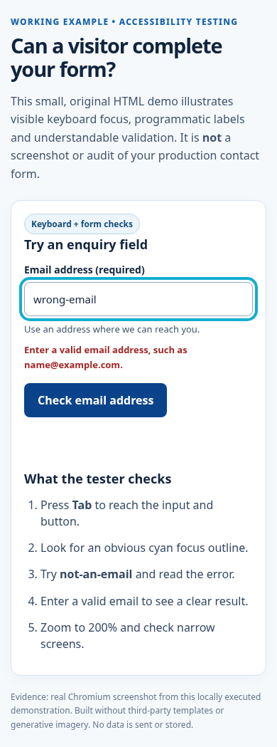
Screenshot: Locally executed demo. Its source code is in the review package; no account data, stock photos or AI-generated artwork are shown.
Test 1 — Complete the main journey using only the keyboard
Reload the page and press Tab to reach navigation links, actions and forms in order. Use Shift + Tab backwards; Enter activates links and many buttons; Space usually activates buttons. Complex widgets may also need arrow keys.
Try opening navigation, reaching Website Design and then Contact without a mouse. Record any keyboard trap or unreachable dropdown.
Pass evidence: all critical actions are reachable and operable without a mouse. Fix direction: use native links and buttons, maintain a logical document order and avoid custom controls without keyboard support.
Test 2 — Confirm the focus indicator is visible
Tab through buttons and navigation on light and dark backgrounds. Each selected control needs an obvious focus indicator; a faint colour change may not be enough.
Pass evidence: focus is visible and not hidden behind fixed content. Fix direction: restore visible focus styling and check overlay behavior.
Test 3 — Check ordinary text contrast
Check a paragraph, button and caption using a contrast tool. WCAG 2.2 Level AA commonly requires 4.5:1 for normal text and 3:1 for large text, with defined exceptions. Inspect text on photographs separately because the background varies.
A pale grey caption on white may look subtle but become unreadable in sunlight or with low vision. Prefer darker text or a stronger overlay rather than increasing font weight as the only response. Preserve sufficient contrast for meaningful graphical controls too.
Pass evidence: sampled text meets applicable contrast guidance in its real state. Fix direction: change the actual colours or background treatment.
Test 4 — Resize text and zoom the page
Increase browser zoom to 200%, then inspect the navigation, service descriptions, forms and footer. Does text remain visible? Can every control still be used? Is a call-to-action clipped by a rigid-height card? A page should also behave reasonably at narrow widths without forcing readers to scroll sideways for ordinary paragraphs.
Pass evidence: content is readable and key tasks still work at increased zoom. Fix direction: use flexible containers, allow wrapping and remove clipping constraints.
Test 5 — Give meaningful images an appropriate text alternative
Inspect each significant image and ask what information someone would miss if it were not visible. A portfolio photograph might need a concise description of the project; an infographic needs a text equivalent conveying its main message, often near the image; a decorative background may need empty alt text so it is skipped.
Pass evidence: informative images are meaningfully described and decorative images are not announced unnecessarily. Fix direction: correct alt attributes and add nearby HTML summaries when the visual is complex.
Test 9 — Test mobile navigation and touch controls
Open the main menu at a narrow screen width. Can it be opened and closed with a tap, keyboard and appropriate assistive controls? Does it cover the whole page with no obvious exit? Can someone locate the current section? Are touch targets comfortably spaced? Does a sticky chat button hide the Submit control at the bottom of a form?
Try portrait and landscape orientation where relevant. Increase text size on your device if possible. Check that zoom is not disabled through the viewport settings and that links are not crowded together.
Pass evidence: the same essential navigation works with touch and keyboard on narrow layouts. Fix direction: simplify menu levels and ensure controls remain visible and operable.
Test 10 — Check headings, reading order and assistive interpretation
Scan the page's headings. Is there one clear main subject and a sensible progression through H2 and H3 sections? A bold-looking paragraph is not automatically a heading. Headings help readers skim and support screen-reader navigation. Try a screen reader such as NVDA with a real browser if you have the expertise; do not rely exclusively on automatic accessibility scores.
Pass evidence: the page's structure and meaning are understandable without its visual styling. Fix direction: repair semantic HTML and test again with assistive technology.
Copyable 10-point accessibility test worksheet
| Test |
Result |
Evidence / owner |
| 1. Keyboard journey completed |
Pass / Fail / Not tested |
|
| 2. Focus visible |
Pass / Fail / Not tested |
|
| 3. Text contrast checked |
Pass / Fail / Not tested |
|
| 4. Zoom and narrow reflow checked |
Pass / Fail / Not tested |
|
| 5. Image alternatives reviewed |
Pass / Fail / Not tested |
|
| 6. Link purposes clear |
Pass / Fail / Not tested |
|
| 7. Fields labelled |
Pass / Fail / Not tested |
|
| 8. Errors and delivery tested |
Pass / Fail / Not tested |
|
| 9. Mobile menu usable |
Pass / Fail / Not tested |
|
| 10. Headings and reading order tested |
Pass / Fail / Not tested |
|
Do not treat a blank worksheet as proof that a site passed. Date the results and record who performed each check. Fix critical blockers first, then retest affected journeys and neighbouring pages.
What this checklist cannot prove
Passing ten informal checks does not certify WCAG conformance or compliance with laws that may apply to a particular business and market. A complete evaluation may require coverage of all relevant success criteria, multiple page templates, dynamic flows, assistive technologies and users with different accessibility needs. Legal requirements vary by jurisdiction. Use this as an entry-level quality check, not a legal certificate.
For related but distinct tasks, see the mobile scanability guide, the contact-page information guide and Neloy website design services.
Final takeaway
Publication check: An original functional demo and real browser screenshots are attached, but manual tests of the published website have not been claimed. A named editor should verify the listed Lighthouse flags, inspect the live form with a keyboard and 200% zoom, confirm image rights, and record a truthful sign-off. No compliance guarantee is made.
Sources: W3C WCAG 2.2; W3C WAI Easy Checks; W3C Forms Tutorial.