Quick answer
Quick answer: To speed up a small business website, measure one important page on mobile and desktop, identify what actually slows it down, resize and compress oversized images, review unnecessary scripts and widgets, and retest the same page after each change. You do not need a full redesign simply because a speed test reports problems. Often the useful fix is smaller and easier to maintain.
A modern-looking site may still feel slow on a phone: a large banner delays the headline, a form appears late, or a chat widget blocks a tap. These customer problems do not automatically justify rebuilding.
This guide is a triage process, not a promise of a particular performance score. Use it first on a backup or staging version of your website. Preserve your URLs, page content, important SEO tags, forms and analytics unless you have a clear reason to change them.
1. Measure the page your customers actually use
Open Google PageSpeed Insights, enter a complete page URL and select Analyze. Begin with the homepage or the service page receiving important enquiries. Record the URL, date, test conditions and both Mobile and Desktop results. Repeat the process for a second meaningful page, such as your contact page, rather than judging your whole business from one homepage number.
PageSpeed Insights combines two different kinds of evidence. Field data, where available, summarizes experiences from real Chrome users over a rolling 28-day period. Lab data uses a simulated test run and is particularly useful for diagnosing page components. A new or low-traffic URL might not have sufficient field data; this is not proof that a page is broken. Google explains the distinction in its official PageSpeed documentation.
Pay attention to three Core Web Vitals when the report provides them: Largest Contentful Paint (LCP) relates to when the largest visible content appears; Interaction to Next Paint (INP) describes responsiveness to interactions; and Cumulative Layout Shift (CLS) captures unexpected movement. Do not treat a lab score as a direct count of customers you lost, and do not invent before-and-after results to make an article more exciting.
Make a baseline note:
| What to record |
Before changes |
After changes |
| Exact URL and test date |
Add your results |
Add your results |
| Mobile and desktop lab results |
Add your results |
Add your results |
| Field data availability |
Available / unavailable |
Available / unavailable |
| Main image issue |
Actual finding |
Recheck |
| Script or widget issue |
Actual finding |
Recheck |
| Mobile form and menu |
Working / issue |
Working / issue |
If nothing is measured, the table should remain blank. It is a worksheet, not a fabricated case study.
Worked example: A real PageSpeed run, not an invented improvement
On 4 November 2026 at 9:46 PM (Bangladesh time), we opened Google PageSpeed Insights for the Neloy Digital Solutions homepage and read its Mobile lab report. The measured Lighthouse categories in that single run were Performance 96/100, Accessibility 94/100, Best Practices 92/100 and SEO 100/100. The lab reported First Contentful Paint 1.8 seconds, Largest Contentful Paint 1.8 seconds, Total Blocking Time 150 milliseconds, Cumulative Layout Shift 0 and Speed Index 2.6 seconds.
The report also suggested improving image delivery (estimated 298 KiB savings) and reducing unused JavaScript (estimated 150 KiB savings). These are diagnostic opportunities, not verified savings from a change. No production speed improvement was attempted or measured as part of this article. A future run might produce different results. Open the PageSpeed report for this URL to run the test yourself.
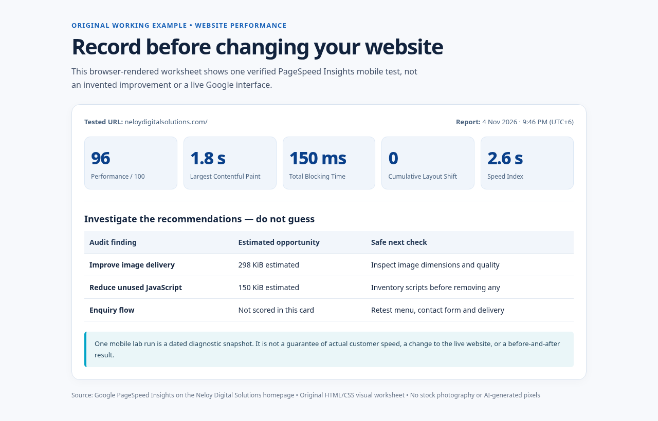
Illustration: A browser screenshot of an original HTML worksheet based on that dated test. The source HTML and mobile screenshot are included in the editorial package. No stock images or generative artwork are used.
2. Fix image weight before rebuilding a layout
Imagine a bakery homepage with a full-width photograph exported from a camera at 4,000 pixels wide. If the page usually displays that image at about 1,200 pixels on desktop and much smaller on mobile, visitors may download far more data than they need. The same problem appears in agency portfolios, team photographs and product cards.
Use browser developer tools to check the image's displayed dimensions and downloaded bytes. Export a suitably sized copy, compare sharpness at normal viewing size and retain the master for rollback.
Choose formats based on content rather than fashion. JPEG remains useful for ordinary photographs. WebP and AVIF may provide smaller photographic files when supported by the site's build workflow and browsers; test transparency, visual quality and decoding. SVG can suit simple logos or diagrams when the source is trusted and safely authored. PNG remains appropriate when a lossless raster or specific transparency requirement matters. No single format is best for every image.
Add meaningful alt text where an image conveys information. Decorative imagery should not produce redundant announcements. Specify image width and height or reserve equivalent layout space to reduce jumps while the image loads. For large above-the-fold images, do not blindly apply lazy loading: the most important visible image may need early loading, while below-the-fold gallery items can often wait.
4. Simplify fonts and visual effects
Check font families, weights and styles. Use a restrained type system or a suitable system-font stack. For self-hosted fonts, request only needed files and subsets, verify licensing and use an appropriate display strategy.
Large animations, autoplay background videos and intricate scrolling effects deserve similar scrutiny. An effect that appears stylish on a desktop may compete with the main heading or make mobile interaction feel delayed. Keep motion purposeful, offer reduced-motion behavior where relevant, and do not strip away accessible content merely to improve a metric.
5. Look for hosting and caching constraints
Slow server responses, uncached assets and repeated database work also matter. Compare HTML response timing with assets, check static cache headers and confirm your content delivery network is working.
Do not cache personal form responses or private account pages as if they were public images. If you use WordPress or another content management system, check backup status and plugin compatibility before changing caching plugins. If you use a custom application, server or framework settings should be reviewed in staging by someone who understands the deployment.
6. Make the improvement safely, in a small sequence
Use this before-and-after checklist rather than making a broad redesign:
| Check |
Before changing |
After changing |
| Homepage hero |
Record displayed size, bytes and appearance |
Recheck quality, layout and bytes |
| Image cards |
Count requests and formats |
Confirm resized files display sharply |
| Third-party code |
Inventory each widget and its owner |
Confirm essential features still work |
| Fonts |
List families, weights and requests |
Check readability, language coverage and loading |
| Page structure |
Note CLS or other layout movement |
Check that content no longer shifts unexpectedly |
| Enquiry journey |
Submit a safe test enquiry |
Verify delivery and confirmation |
| Mobile navigation |
Open every critical menu |
Confirm tap and keyboard operation |
| SEO essentials |
Record canonical, headings and key URLs |
Confirm they are unchanged unless approved |
Use the same URL, device mode and test method before and after. Lab results naturally vary, so repeat tests instead of celebrating a single unusually favourable run. Explain both a successful change and any trade-off honestly.
7. When to call a professional developer
Professional help is appropriate when the main HTML response is consistently slow, JavaScript causes long delays, layout shifts originate in framework code, a caching change affects private content, an important integration breaks, or the site's deployment pipeline is unfamiliar. Request a narrow scope: an inventory of findings, the highest-impact proposed change, rollback steps and a tested verification report. Avoid buying a complete rebuild before someone demonstrates why a smaller correction cannot solve the issue.
If your main concern is the structure of your pages, consult the existing website launch checklist. For the phone reading experience, the mobile scanability guide covers a different problem. Neloy Digital Solutions also describes its website design and development support for projects that need technical changes.
Final takeaway
A faster website is not simply one with a higher test score. It is a site that lets a real customer read, navigate, compare and enquire without unnecessary friction. Start with measured problems, fix oversized assets and optional code first, preserve working customer journeys, and document the result. Only consider rebuilding when the evidence points to a deeper architectural problem.
Publication check: The dated PageSpeed measurements above were observed in a real run; the included image is a separately identified original HTML worksheet screenshot, not a screenshot of Google PageSpeed. An editor should confirm the report attribution, final screenshot rights, all internal links, and the final site styling before approval. There is no before-and-after claim.
Sources: Google PageSpeed Insights documentation; web.dev image guidance; web.dev Web Vitals.